
Versus
Product design for a control disinfection robot app
The project was created during my UX\UI studies at “Codesigner” school
Summary
An application for managing an autonomous disinfection robot for public buildings Which allows smart remote control of all of the robot operations for maximal disinfection.
My role
As an industrial designer, at "Civdrone-Robotics", during the COVID-19 episode I was leading the designing process of the CVC disinfection robot.
Later when I started my UX/UI studies at "Codesigner" school I chose to design the user experience of an application that controls this robot.
Main flow
Select robot
Select routes
Start disinfect

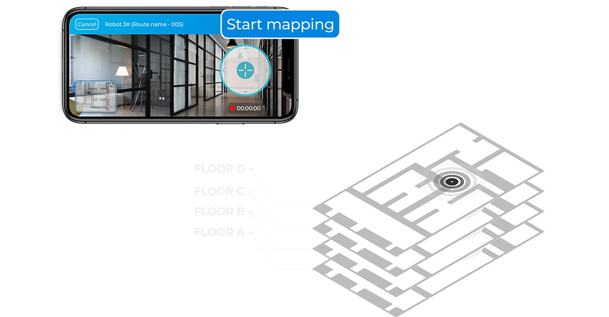
MAPPING YOUR ROUTE
By press the button you can start moving the robot around the space to record routes - and after that you can Let the robot disinfect autonomously.
Style guide
Colors
Typography
Icons
Components

The challenge
The mission was to design a system that controls autonomous disinfection robots in public buildings.
It had to be an easy and intuitive control system that any maintenance person in any office, shopping center or school building can easily operate.
Motivation
Nowadays, the levels of hygiene and disinfection are very important and also require more manpower and resources. Technology can give us efficient disinfection results.
Research
I started with brainstorming to explore the topic.
I collected all my knowledge about the physical product in order to create the correct interface with the app. Next, I did some competitor research and user research.
Competitive research conclusions
Many applications fail to produce a simple and convenient user experience with a clear indication of the connection between the mobile and the robot.
It is important to give the users easy access and a popup link to their settings for permissions to the location\camera or WIFI without leaving the app and going to the phone settings by themselves.
When the robot is working and the user is not around, it is important that the application will show the status of the operation and notify the user if something is wrong. for example "PANGO" -a parking payment app - alerts if the parking needs to be renewed or if an officer checked the vehicle but everything is fine.
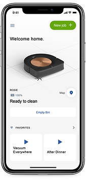
I-robot
Benefits
1 - The user experience of the initial connection between the robot and the mobile is comfortable and they use a nice animation to make it clear.
2 - The house mapping works well and the users can easily select areas to clean by dragging a square on the screen that can also be resized.
Disadvantages
1- There are lots of pop-up alerts that ask the users to rate the app many times, even before they started to use it.
2- The app does not send notifications about maintenance, like brush replacement.
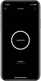
Nuki - smart lock
Nuki is an application for controlling a smart door lock
Benefits
1- There is a Night mode option for special situations for example; when you get to your doorstep and the light is not working.
2- The button is located in the middle of the screen and helps the user to lock/unlock quickly.
3- There is a clear illustration of the locking action, with animation and loud sound effects so the users can be sure that the door is locked.
Disadvantages
1- The background of the screen is too dark during the boot process and it makes it difficult to understand the steps.
2- The setting menu is hidden and the user needs to press 5 buttons to get there.
User flow diagram
The sequence of user actions shown in the diagram below, helped me to effectively and correctly create the user experience screens.

Main wireframe flow
Robot Selection> Robot Status> Disinfection Zone Selection> Recording a New Track.
